Learn to read a price chart accurately before you try to predict anything from it. Every claim here is checked against central bank research, regulators' publications and peer-reviewed studies.
Technical analysis is the use of past prices, and other market data such as volume, to guide trading decisions [1]. It is popular with professionals: in a 1992 survey cited by a St. Louis Fed paper on currency markets, 90% of respondents reported using some form of it [1]. Popular is not the same as profitable, and this topic keeps the two apart.
The same St. Louis Fed paper reports that simple trading rules on dollar exchange rates earned positive risk-adjusted returns for about 15 years in the 1970s and 80s, and that those returns were then extinguished [1]. So each explainer here teaches the mechanics first and the evidence second, including the parts that disappoint.
Read the explainers in order if you are new. How to read a candlestick chart shows the four prices in every candle and how time frames change them. Support and resistance looks at a New York Fed study that measured how often published levels stopped currency moves, against random levels. Moving averages calculates simple and exponential averages by hand and shows why they lag. Volume and liquidity explains why the amount traded affects the price you actually get. Backtesting pitfalls shows why strategies tested on old data tend to look better than they trade. Technical vs fundamental analysis compares chart-based and economic approaches.
Each page includes worked examples calculated in code, a table, the mistakes beginners make most often and links to the primary sources behind every number.
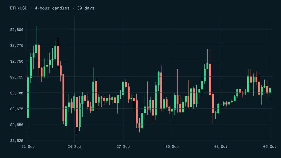
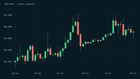
Every candle shows four prices: open, close, high and low. How to read the body and shadows, why the time frame changes the picture, and what studies say about candlestick patterns.
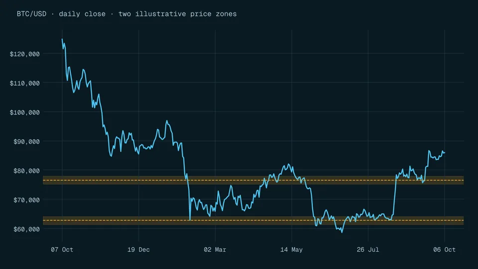
A New York Fed study found published support and resistance levels stopped currency trends 60.8% of the time, against 56.2% for random levels. What that edge means, and why round numbers and stop orders sit at the centre of it.
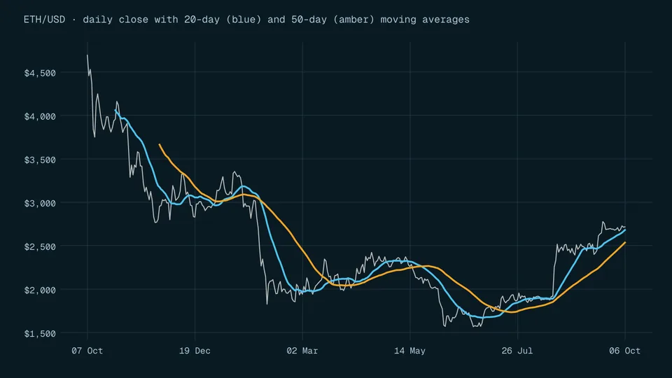
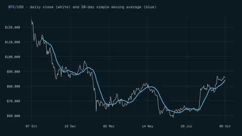
How simple and exponential moving averages are calculated, why they always lag, and why classic crossover rules stopped working in currency markets by the early 1990s.
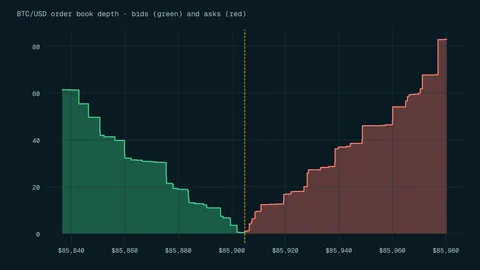
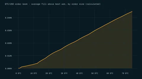
Low volume usually means wider spreads, worse fills and stops that slip. What the two words mean, how to check them before a trade and why some crypto volume is fake.
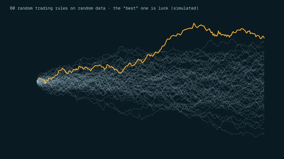
Backtests are built with hindsight, tuned on the same data they are judged on, and usually skip real costs. The five main traps, a simulation of 200 random rules and what regulators require.
Charts versus accounts and economic data: what each approach looks at, the survey evidence on who uses which, a worked P/E example and the limits central-bank research found.
A candlestick shows four prices for one period: open, high, low and close. How to read the body and wicks, with a calculated example and pattern evidence.
A moving average is the mean of the last N prices, recalculated each period. How to calculate one, why it lags, and how simple and exponential versions differ.
Slippage is the gap between the price you expected and the price you got. Why it happens, how it makes a stop-loss cost more, and how to limit it.
Questions people ask about this topic
Where should a beginner start with charts?
With the candle itself. Learn the four prices it records in how to read a candlestick chart, then move on to levels and averages.
Does technical analysis work?
The evidence is mixed and often weak. Traditional moving-average and filter rules in currency markets had become unprofitable by the early 1990s [1], and most candlestick reversal patterns in a ten-year study of Thai stocks had average returns not different from zero [2].
Do I need special software?
No. Most broker and exchange apps draw candlesticks and moving averages. What matters more is knowing what the lines mean and what they cannot tell you.