Explainer · Charts & Analysis
How to read a candlestick chart
A candlestick packs four prices from one period into a single shape. Learn to read those four numbers before you read anything into the pattern they make.
Quick answer
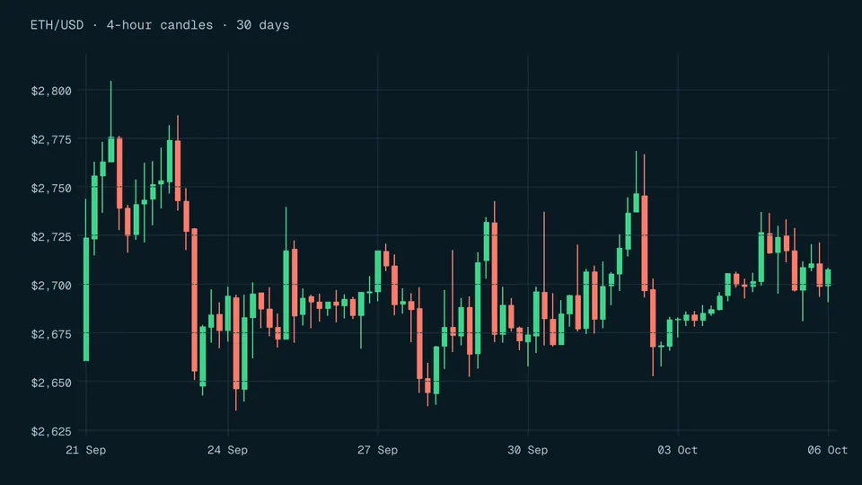
Each candle covers one period. The body spans the open and close; the thin lines above and below (shadows) reach the high and low [2]. The colour shows whether price closed up or down. In a ten-year study of Thai stocks, most reversal patterns earned average returns not different from zero [2].
Key points
- A candle is four prices from one period: open, high, low and close [1].
- The body is the open-to-close range; the upper and lower shadows mark the high and the low [2].
- Colours are a display setting, not a standard: check your platform's legend before reading direction.
- The same hours look different on a 1-hour and a 4-hour chart, because one candle merges several periods (calculated example below).
- In a study of 50 Thai stocks over ten years, most reversal patterns had average returns not statistically different from zero [2].
On this page
What does a single candlestick show?#
A candlestick chart draws one candle for each period you choose: a minute, an hour, a day or a week. A peer-reviewed study describes it simply: each stick shows the range between the opening and closing price as the body, plus the highest and lowest traded prices [1].
So every candle answers four questions about its period. Where did trading start (open)? Where did it end (close)? How high did it go (high)? How low did it go (low)? Nothing else is in the shape. There is no volume, no news and no information about what happened in what order inside the period.
| Price | What it means | Where it sits on the candle |
|---|---|---|
| Open | First traded price of the period | One end of the body |
| Close | Last traded price of the period | The other end of the body |
| High | Highest traded price of the period | Tip of the upper shadow |
| Low | Lowest traded price of the period | Tip of the lower shadow |
Body and shadow definitions from a 2017 peer-reviewed study [2]; a 2021 PLOS ONE paper describes the same body and high-to-low range [1].
How do you read the body and the shadows?#
Read a candle in a fixed order so you do not jump to conclusions from its shape. The 2017 study by Tharavanij, Siraprapasiri and Rajchamaha defines the real body as the difference between the open and close, and the upper and lower shadows as the high and low within the time frame [2]. Turning those definitions into steps:
- Check the time frame
Look at the chart setting first. A daily candle and a 5-minute candle with the same shape describe very different amounts of trading.
- Find the direction
Use the colour legend, or compare the ends of the body with the price axis. If the close is above the open, price rose over the period.
- Measure the body
Body = close minus open. A large body relative to the whole candle means price ended far from where it started.
- Measure the shadows
Upper shadow = high minus the top of the body. Lower shadow = bottom of the body minus the low. Long shadows mean price travelled further than where it settled.
- Body
- $3.10close minus open, calculated
- Upper shadow
- $1.40high minus close, calculated
- Lower shadow
- $1.80open minus low, calculated
- Body share of range
- 49.2%$3.10 / $6.30, calculated
What do the colours on a candlestick mean?#
Colour only tells you whether the close finished above or below the open. There is no single standard. The Thai stock study uses a white body for a rising day and a black body for a falling day [2], while the PLOS ONE paper draws rising sticks in a light colour and falling sticks in grey on a black background [1]. Many apps use green and red, and some let you swap them.
A second invented candle shows a falling period: open $103.10, high $103.60, low $99.40, close $99.90. The body is $3.20 down, both shadows are $0.50, and the body fills 76.2% of the range (calculated). Whatever colour your platform paints it, the numbers say the period opened near its high and closed near its low.
Does the time frame change what a candle means?#
Yes. A longer candle is built from shorter ones: its open is the first open, its close is the last close, its high is the highest high and its low is the lowest low. Detail inside the period disappears.
The table shows four invented 1-hour candles merged into one 4-hour candle. Two hours rose and two fell, but the 4-hour candle shows only a small $0.20 fall with a long $0.90 upper shadow (calculated).
| Period | Open | High | Low | Close | Body |
|---|---|---|---|---|---|
| Hour 1 | $50.00 | $50.40 | $49.70 | $50.30 | +$0.30 |
| Hour 2 | $50.30 | $50.90 | $50.20 | $50.80 | +$0.50 |
| Hour 3 | $50.80 | $50.85 | $49.90 | $50.05 | -$0.75 |
| Hour 4 | $50.05 | $50.25 | $49.60 | $49.80 | -$0.25 |
| 4-hour candle | $50.00 | $50.90 | $49.60 | $49.80 | -$0.20 |
4-hour open = hour 1 open, close = hour 4 close, high and low = extremes of all four hours.
The PLOS ONE study tested its model on daily data [1], and a paper cited in the 2017 study argues candlestick charting is best suited to daily price series [2]. Neither claim means short time frames are wrong; it means research results from daily charts do not automatically transfer to 1-minute charts.
Do candlestick patterns predict prices?#
Books and videos name many patterns made from one to three candles. The evidence that they help on their own is weak, and depends heavily on how a test is set up.
The 2017 study tested one-, two- and three-day bullish and bearish reversal patterns on the 50 largest Thai stocks from July 3, 2006 to June 30, 2016. It found little use for them: the mean returns of most patterns were not statistically different from zero, and even the significant ones carried high risk measured by standard deviation [2]. A study of Dow Jones stocks found eight three-day patterns profitable with one exit rule but not with another, so the result depended on when the trader got out, not only on the pattern [3].
| Study | Market and data | Finding |
|---|---|---|
| SAGE Open, 2017 | 50 Thai stocks, daily, 2006 to 2016 | Most reversal patterns: mean returns not different from zero |
| Journal of Banking & Finance, 2015 | Dow Jones stocks | Eight 3-day patterns profitable with one holding rule, not with another |
| PLOS ONE, 2021 | Taiwan and Nikkei indexes, daily | Model direction accuracy 80.82% on one index, 66.53% on the other |
Sources: 2017 study [2], 2015 study [3], 2021 study [1]. The 2021 figures are a deep-learning model's accuracy at guessing direction, not trading profit after costs.
The PLOS ONE result is a useful warning in itself: the same method scored 14.29 percentage points lower on the Nikkei 225 than on the Taiwan index, over different test years (calculated from [1]). A pattern that looks reliable on one market can be much weaker on another. Our page on backtesting pitfalls explains why past tests tend to look better than live trading.
What can a candlestick not tell you?#
A candle shows prices that already traded. It does not show the price you would get. The SEC notes that the last-traded price is not necessarily the price at which a market order will be executed [4]. Our guide to market, limit and stop orders explains the difference.
A candle also does not show how much traded, or why. Many charts add volume bars underneath for that, which we cover in volume and liquidity. And a level where several candles turned is only a starting point for the questions in support and resistance.
Mistakes beginners make with candlestick charts#
- Ignoring the time frame
Comparing a 5-minute candle with a daily candle as if they carried the same weight. Always read the chart setting first.
- Trading a pattern name
Treating a named shape as a signal. Most reversal patterns in the Thai study did not produce returns different from zero [2].
- Reading the close as your price
The last traded price is not a promise of your fill [4], and spreads and fees come on top.
- Forgetting what is hidden
A long shadow shows a range, not the path. Price may have hit the high first or last; one candle cannot tell you which.
Frequently asked questions#
What are the four prices in a candlestick?
Open, high, low and close for the period. The body spans the open and close and the shadows reach the high and low [2].
What is the difference between a wick and a shadow?
None. Shadow is the term used in the research papers we cite; wick is a common platform term for the same thin line.
Which candlestick time frame should a beginner use?
Are candlestick patterns reliable?
Not on their own, according to the studies we cite. Results depend on the market, the period and the exit rule [3].
The bottom line#
Read every candle as four numbers before you read it as a shape: check the time frame, find the direction, measure the body, then measure the shadows. Treat colour as a setting and patterns as questions, not signals. Next, see how traders mark price zones in support and resistance, or look up the short definition in our candlestick glossary entry.
Sources
- DPP: Deep predictor for price movement from candlestick charts.
- Profitability of Candlestick Charting Patterns in the Stock Exchange of Thailand (Piyapas Tharavanij, Vasan Siraprapasiri, Kittichai Rajchamaha), SAGE Open, October-December 2017.
- Trend definition or holding strategy: What determines the profitability of candlestick charting?" (abstract, Journal of Banking & Finance 61(C), 2015, pp. 172-183).
- Types of Orders" (Investor.gov).
Education only. This page is not investment, tax or legal advice. Trading and crypto can lose you money. See our risk disclosure.